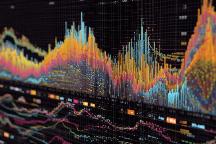
Experience Seamless Financial Data Visualization in Google Search
Google’s groundbreaking new Search tool, now powered by AI Mode, transforms how users access and analyze financial data. Most importantly, this upgrade introduces interactive charts for stocks and mutual funds, allowing you to visualize market trends and compare performances directly within Google Search. In this post, you’ll learn how to access this feature, understand its capabilities, and discover best practices for ensuring data reliability.
What Is Google Search’s Interactive Financial Chart Feature?
With the latest update, Google AI Mode delivers interactive data visualizations tailored to your queries about stocks and mutual funds. For example, you can simply ask, “Show me the five-year stock performance for major tech companies,” and Google will present a dynamic chart. You can then explore specific periods or compare different assets—all without leaving the Search results page.[3]
How Does It Work?
Powered by Gemini, Google’s advanced AI engine, this tool understands natural language prompts and taps into real-time as well as historical data. Therefore, you no longer need to manually research and aggregate financial data from multiple sources. Instead, simply state your request, such as “compare mutual funds with the best returns over the past decade,” and receive a custom interactive chart, complete with a detailed explanation.[1] Besides that, follow-up questions are now easier than ever, thanks to Gemini’s multi-step reasoning and conversational abilities.[2]
How to Try Google’s Interactive Charts
Currently, this feature is rolling out in Google’s Labs under AI Mode, and is initially available to users in the United States. To try it for yourself:
- Go to Google Search Labs and enable “AI Mode.” Ensure you’re signed in with your Google account.
- Enter a finance-related query in the search bar, such as “interactive chart for MSFT stock over the past five years.”
- Google’s AI Mode will generate the chart instantly. You can interact with the chart, using sliders to examine specific date ranges, or hover to see detailed values.
- Ask follow-up questions about the data—just like you would in a chat.
Be aware that some workplaces may restrict access to experimental features. Therefore, if you encounter issues, try accessing Labs from a personal device.[1]
Powerful Use Cases for Investors and Analysts
This new capability is a game changer for anyone in finance. For instance, analysts can quickly compare peer companies’ stock performances without manual charting. Individual investors can visualize mutual fund returns or dividend histories with just a simple search. Because follow-up queries are understood, you can seamlessly transition from data visualization to in-depth analysis—all within the same chat.[3]
Accuracy and Data Validation
While Google’s tools dramatically improve accessibility to financial charts, users should remain vigilant. As with any AI-generated output, it’s crucial to check the sources provided for the underlying data. If Google’s explanation links to specific data sources, always verify that the chart matches the raw data.[1] In cases where no source is listed, manually cross-check important figures, especially before making financial decisions. Google’s own experts and many in the finance sector recommend exercising caution, as AI models continue to improve their quantitative accuracy.
What’s Next for Google AI Mode?
The current Labs rollout previews a broader integration of data visualization in Search. Over time, these dynamic charts are expected to expand beyond finance, potentially covering sports, economics, and other data-driven fields.[2] As user feedback shapes development, we anticipate even more powerful and intuitive charting tools in the near future.
Final Thoughts: The Future of Data in Search
Google’s new interactive charts simplify financial analysis, making data exploration accessible to everyone. By bringing real-time visualization tools directly into Search, Google is setting a new standard for digital information discovery. Try out the Labs feature today and experience firsthand how AI-powered visualization can transform your approach to finance.
Reference Links
- Google Blog: AI Mode Data Visualization
- CNET: Google’s AI Mode Creates Interactive Stock Charts
- BGR: Google AI Mode Brings Interactive Graphs
- Ground News: Financial Info Into Interactive Charts


